BanBoards
Most business tools treat data like a math problem when it should be treated like a story. Banboards is a Business Analytics Navigator built to pull messy information from CRMs and turn it into clear visuals. While the dashboard was already in progress, I was brought in to design the marketing website and the investor pitch deck. My goal was to take something heavy and complex and make it feel as approachable as a conversation with a colleague.
Category:
Web Design
Date:


The Friction: Data is Boring and Broken
The problem was clear from the start. Business owners were overwhelmed by numbers but couldn't find the actual insights they needed. Information was scattered across too many different tools and most people found the process of analyzing it exhausting. We weren't just fighting bad layouts. We were fighting the "Data Fatigue" that happens when software is too technical for its own good. If a user can’t understand a metric at a glance, the tool isn't doing its job.

The Shift: Moving Away from Corporate Templates
My first few drafts were safe and followed a very traditional corporate style. They looked professional but they didn't have any personality. After looking closer at the brand’s goals, I realized I needed to capture the same friendly and human feel that a platform like Slack offers. I decided to step away from my own comfort zone and break a few standard design rules. I moved from stiff, dry tables to a narrative layout that focuses on how this data actually helps a person make a better decision.

The Goal: Creating a Single Source of Truth Primary
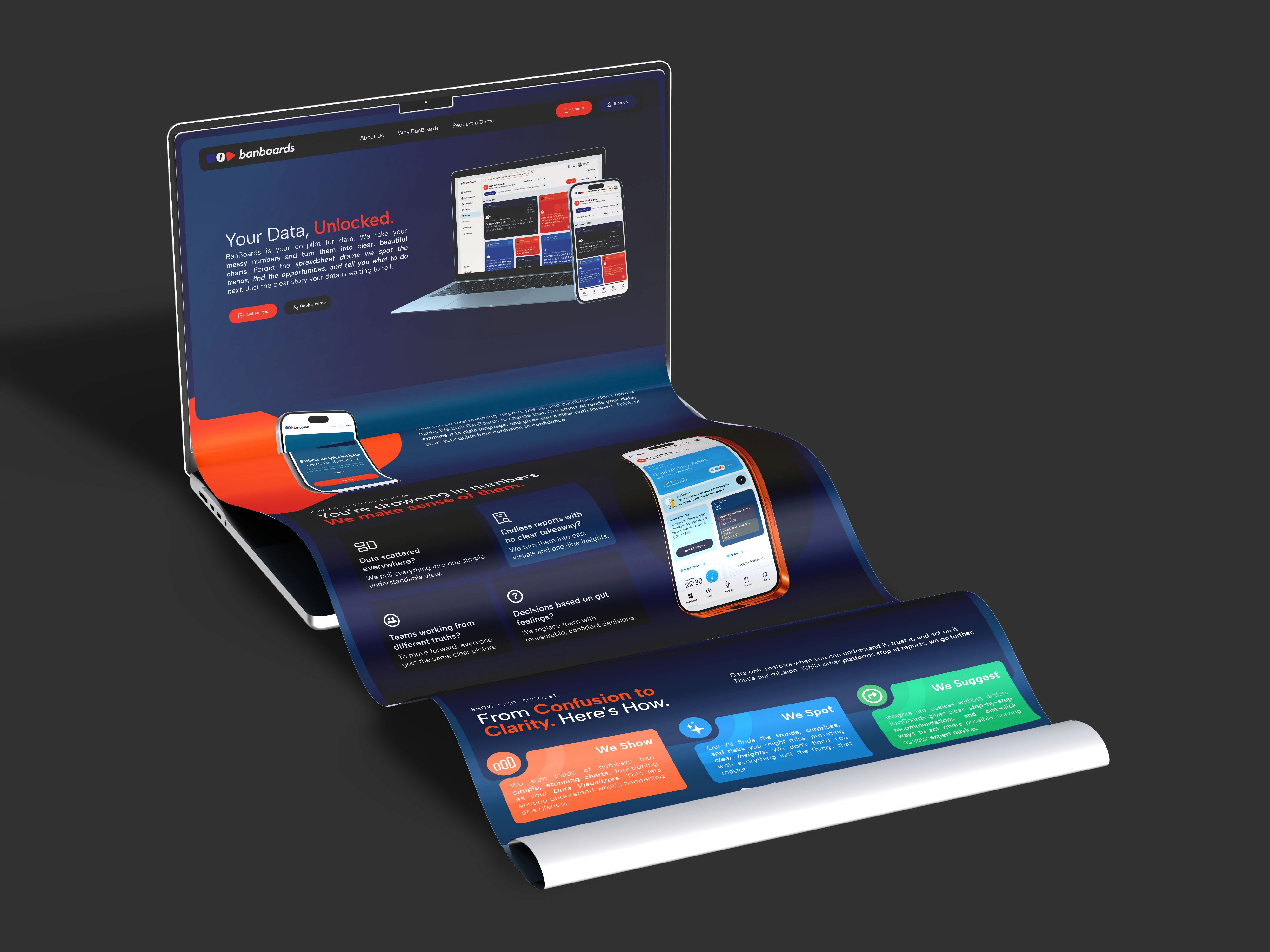
I redesigned the landing page to position Banboards as a centralized hub for all business reporting. The strategy focused on three main pillars.
First, we highlighted real time updates so users felt an immediate sense of control.
Second, I used high contrast visuals to make the most important data stand out instantly.
Third, I simplified the messaging so the benefit was obvious within the first few seconds of scrolling.

The Strategy: Making Complexity Easy to Scan
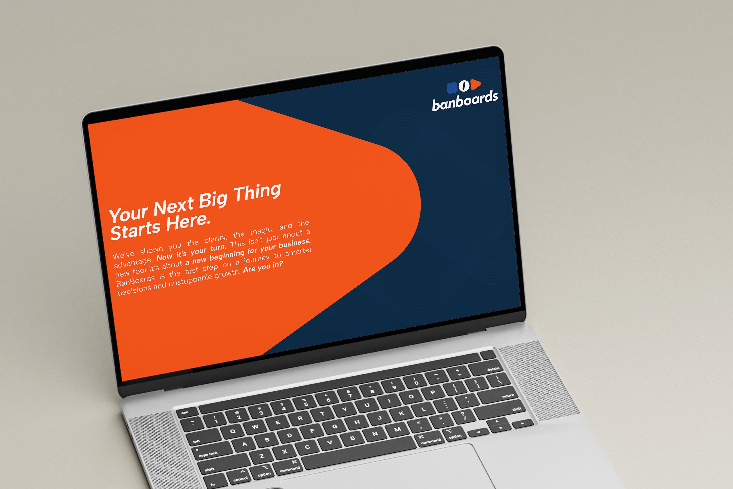
The pitch deck presented a different challenge because investors need to see the big picture without getting lost in the technical details. I avoided the usual data dump that kills interest. Instead, I used a clean and open structure to highlight the AI driven insights and predictive intelligence. By focusing on a "Smarter Way Forward" story, we made the product’s growth potential easy to understand and hard to ignore.
The Result: Turning Confusion into Confidence
The final result was a modern and crisp brand identity that actually encouraged people to sign up. By moving away from a "Safe" design, we created a marketing site that feels like a partner in growth rather than just another piece of software. A website that is easy to navigate and understand on the first visit has the power to build trust quickly and significantly increase user downloads.